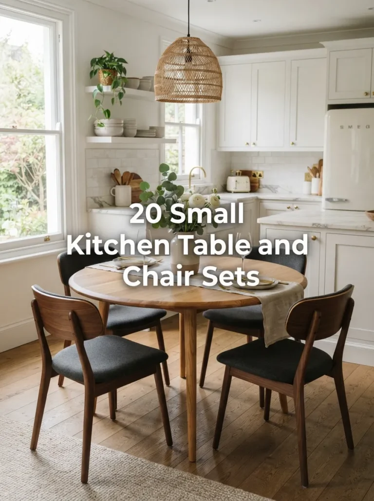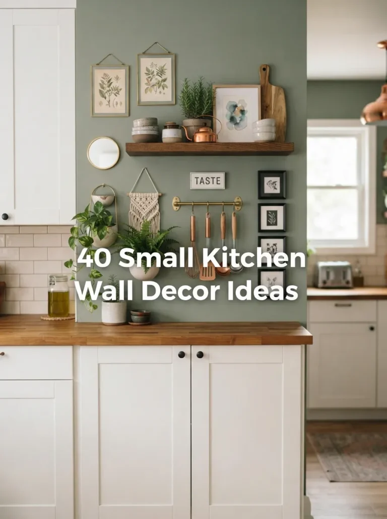
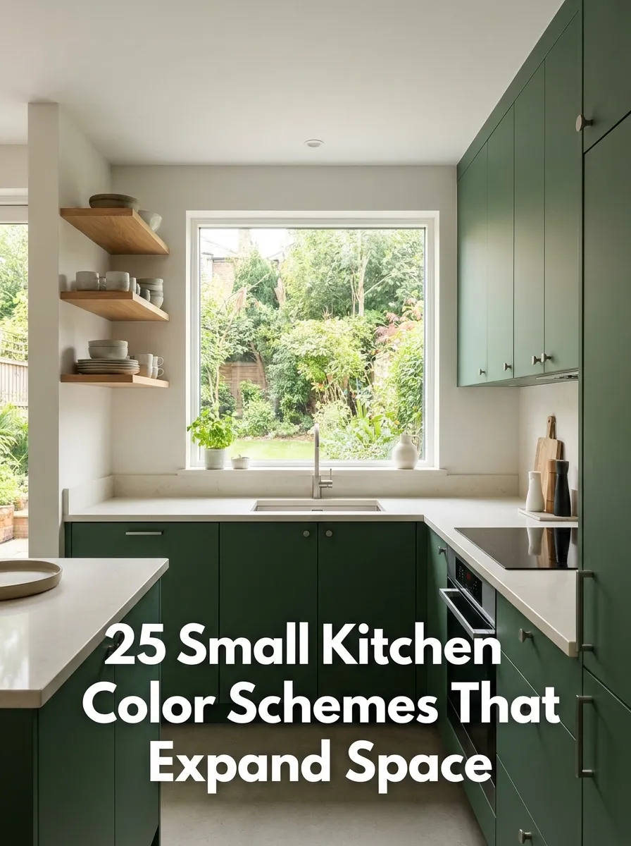
25 Small Kitchen Color Schemes That Expand Space
Small kitchen color schemes wield remarkable power to visually expand cramped cooking spaces, making rooms feel 30-50% larger without knocking down walls or spending thousands on renovations. The right color combinations leverage psychological perception, light reflection, and spatial psychology to transform tight quarters into airy, inviting kitchens that feel spacious and sophisticated. From classic all-white palettes to trending two-tone combinations and bold accent strategies, strategic color selection represents one of the most impactful—and budget-friendly—design decisions you’ll make.
Color affects not only aesthetics but actual spatial perception. Light hues reflect illumination while dark tones absorb it, directly impacting how large or small spaces feel. Understanding which color schemes expand space, which combinations work harmoniously, and how to apply colors strategically across cabinets, walls, counters, and accents empowers you to maximize your small kitchen’s potential regardless of actual square footage.
⭐ Quick Takeaways
- Light colors reflect 70-80% of light vs. 10-20% for dark colors—dramatically expanding perceived space
- Monochromatic schemes (single color family) create maximum visual expansion
- White remains #1 space-expanding color, making kitchens feel 40% larger
- Two-tone combinations (light uppers + darker lowers) add depth without shrinking space
- Accent colors should comprise maximum 10% of total color palette in small kitchens
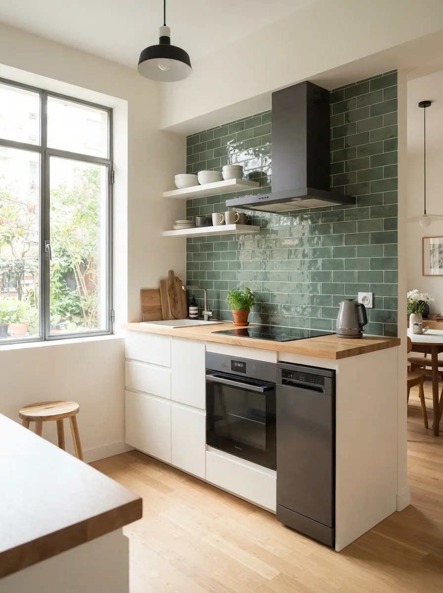
Cohesive small kitchen color palette featuring white, green, and warm wood creating spacious feel
📑 Table of Contents
Color Psychology & Space Perception in Small Kitchens
Understanding how colors affect spatial perception empowers you to make strategic choices that maximize your small kitchen’s visual impact. Color psychology combines scientific principles of light reflection with human psychological responses to create tangible effects on how large or small spaces feel.
How Light Colors Expand Space
Light colors—whites, creams, light grays, pale blues—function as spatial expanders through multiple mechanisms working together to trick the eye into perceiving more square footage than actually exists.
- Light reflection: White reflects 70-80% of light vs. 10-20% for dark colors, brightening rooms and pushing walls outward visually
- Visual recession: Light colors appear to recede from eye, making walls seem farther away
- Reduced contrast: Minimal contrast between surfaces creates seamless flow without visual interruption
- Psychological association: Humans associate light, bright spaces with openness and airiness
- Ceiling height illusion: Light ceilings appear higher, adding vertical spaciousness
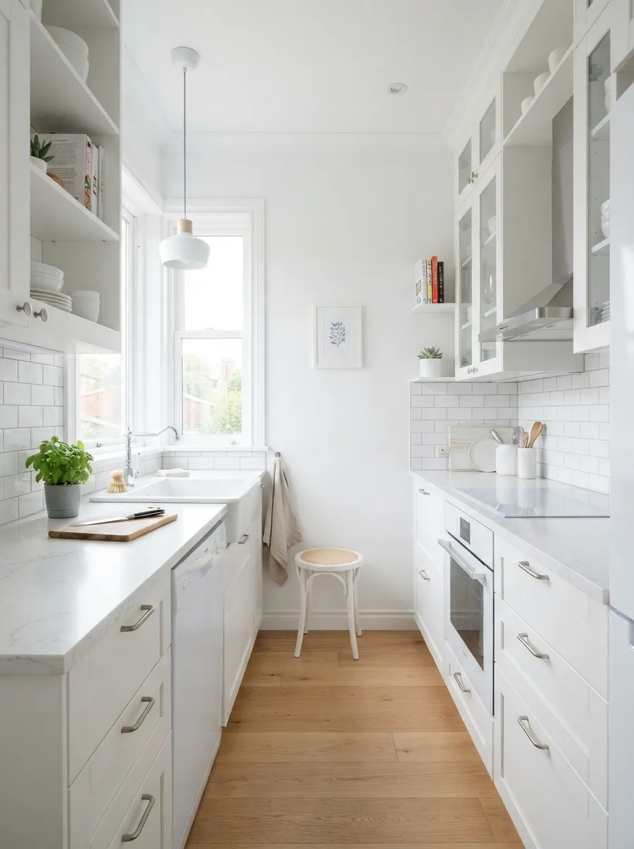
White surfaces maximize light reflection creating significant space expansion in compact kitchen
Why Dark Colors Shrink Space
Dark colors—navy, black, deep green, charcoal—absorb light rather than reflecting it, creating cozy, intimate atmospheres ideal for large spaces but challenging in small kitchens.
- Light absorption: Dark surfaces absorb 80-90% of light, dimming spaces significantly
- Visual advancement: Dark colors appear to advance toward eye, making walls feel closer
- Reduced brightness: Less reflected light requires more artificial illumination
- Boundary emphasis: Strong contrast between dark surfaces highlights limitations rather than expanding them
- Cave effect: All-dark small spaces can feel oppressive and claustrophobic
The Power of Cool vs. Warm Colors
Beyond lightness and darkness, color temperature (cool vs. warm) significantly impacts spatial perception and atmosphere.
Cool Colors (Blues, Greens, Grays)
- Spatial effect: Recede visually, making walls appear farther away
- Psychological impact: Calming, serene, clean, fresh
- Light quality: Reflect cooler light, can feel clinical without warm accents
- Best for: Kitchens with ample warm natural light; modern aesthetics
Warm Colors (Creams, Beiges, Warm Whites)
- Spatial effect: Advance slightly but create inviting warmth
- Psychological impact: Welcoming, cozy, friendly, comfortable
- Light quality: Reflect warm light, preventing sterile feeling
- Best for: Kitchens with limited natural light; traditional styles; north-facing rooms
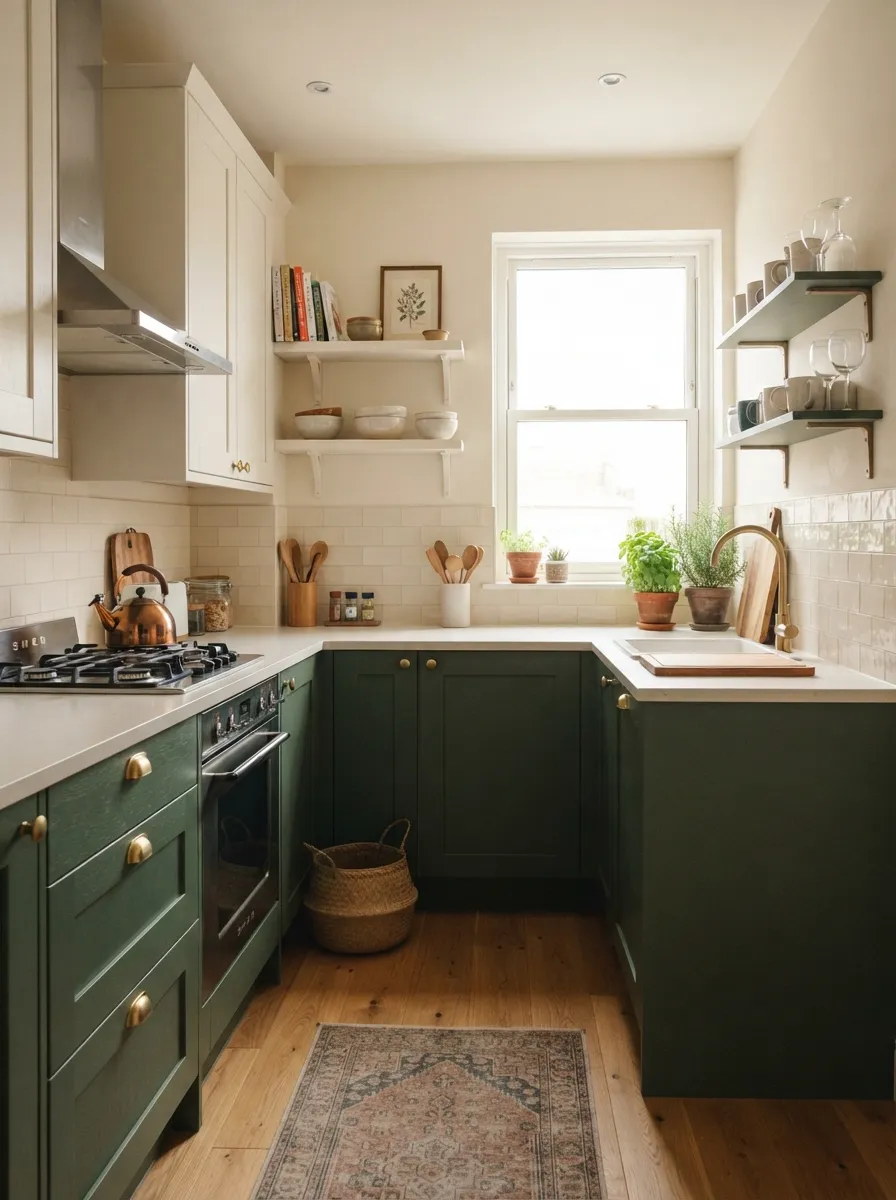
Forest green cabinets balanced with warm white walls demonstrate effective color temperature mixing
Best Colors for Expanding Small Kitchens
Certain colors consistently outperform others in creating visual spaciousness. Understanding the top performers helps you make confident choices aligned with your style preferences.
1. White: The Ultimate Space Expander
White remains undefeated as the most effective color for maximizing perceived space in small kitchens, with pure white creating the strongest effect.
- Space gain: Makes kitchens feel 35-45% larger through maximum light reflection
- Versatility: Works with every design style from modern to farmhouse
- Cabinet pairing: Coordinates with any countertop, flooring, or backsplash color
- Variations: Pure white, warm white, soft white, ivory, cream
- Challenge: Can feel sterile without texture and warm accents
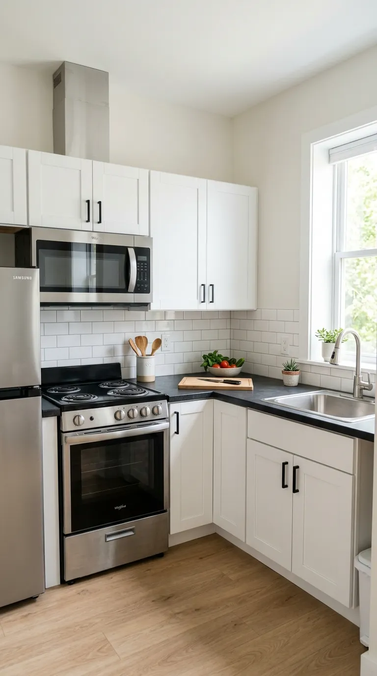
Simple all-white small kitchen demonstrates maximum space expansion through light color palette
2. Light Gray: Contemporary Alternative
Light gray offers sophisticated alternative to white while maintaining excellent space-expanding properties.
- Space gain: 25-35% perceived expansion; slightly less than white but still significant
- Benefits: Hides imperfections better than white; contemporary aesthetic; less stark
- Best shades: Pale gray, greige (gray-beige), silver, dove gray
- Undertone importance: Choose warm gray (beige undertones) vs. cool gray (blue undertones) based on lighting
3. Soft Cream and Beige: Warm Neutrals
Cream and beige provide warmth absent in pure white while maintaining space-expanding qualities.
- Space gain: 20-30% expansion; warm tones advance slightly more than cool
- Advantages: Inviting, prevents clinical feeling, works in low-light kitchens
- Style fit: Traditional, farmhouse, cottage, transitional designs
- Pairing: Coordinates beautifully with wood tones and natural materials
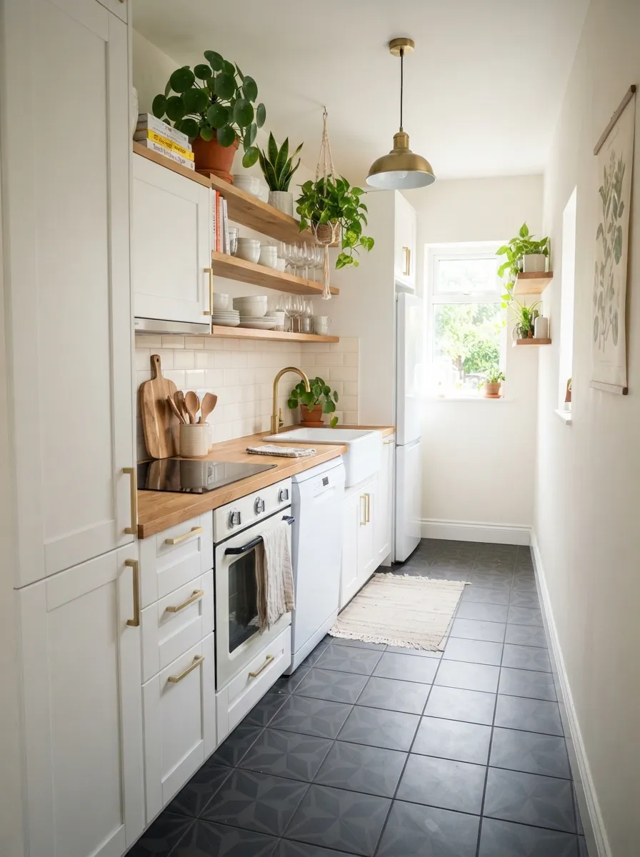
White cabinetry with cream walls creates warm neutral palette in small kitchen
4. Pale Sage and Mint: Soft Greens
Light green shades bring nature-inspired freshness while maintaining spatial openness.
- Space gain: 20-25% expansion when kept very light and desaturated
- Psychological benefit: Calming, refreshing, connects to nature
- Trending: Sage green currently popular; timeless enough for longevity
- Application: Best on single wall or lower cabinets; pair with white uppers
5. Soft Blue: Airy and Coastal
Light blue creates sky-like expansiveness and airy, coastal atmosphere in small kitchens.
- Space gain: 20-30% expansion; cool colors recede naturally
- Mood: Serene, calm, clean, fresh
- Best shades: Powder blue, ice blue, robin’s egg, pale aqua
- Consideration: Can feel cold; balance with warm wood or brass accents
25 Space-Expanding Color Schemes for Small Kitchens
These proven color combinations maximize visual space while delivering cohesive, stylish aesthetics across various design preferences and budgets.
Classic Neutral Schemes
1. All-White Minimalist
Colors: Pure white cabinets + white walls + white ceiling + white counters
Space gain: Maximum (40-50%)
Style: Modern, Scandinavian, minimalist
Pro: Largest perceived expansion; timeless; budget-friendly
Con: Can feel sterile; shows dirt easily; needs texture variation
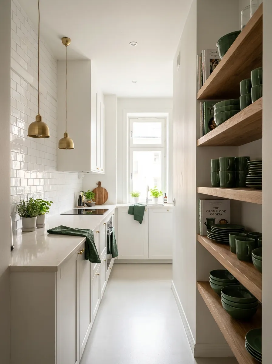
All-white galley kitchen achieves maximum visual space expansion through monochromatic scheme
2. Warm White with Wood Accents
Colors: Warm white/cream cabinets + warm white walls + natural wood floors/counters
Space gain: High (35-40%)
Style: Scandinavian, farmhouse, transitional
Pro: Inviting warmth; prevents sterile feeling; adds texture
Con: Wood requires maintenance; may yellow over time
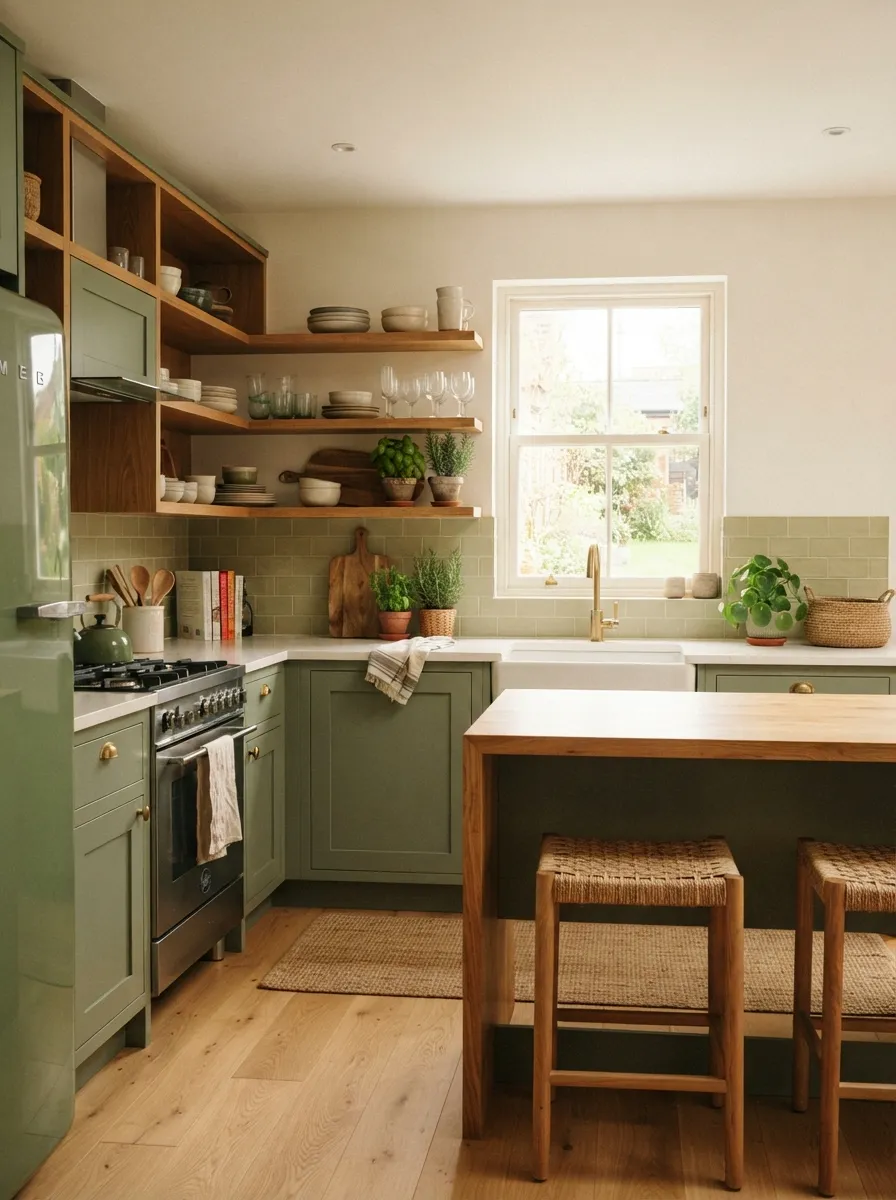
Wood accents add warmth to white kitchen without compromising spaciousness
3. Light Gray Monochrome
Colors: Light gray cabinets + slightly lighter gray walls + white ceiling
Space gain: High (30-35%)
Style: Contemporary, modern, transitional
Pro: Sophisticated; hides imperfections; less stark than white
Con: Can feel cold without warm accents; undertone selection critical
4. Greige (Gray-Beige) Blend
Colors: Greige cabinets + lighter greige walls + white trim and ceiling
Space gain: Medium-High (25-30%)
Style: Transitional, contemporary, versatile
Pro: Perfect neutral bridging warm and cool; universally flattering
Con: Can read as muddy if wrong undertone; test extensively
5. Cream and White Combination
Colors: Cream/ivory cabinets + warm white walls + white ceiling
Space gain: High (30-35%)
Style: Traditional, cottage, farmhouse
Pro: Warm and inviting; coordinates with brass/gold fixtures
Con: Less crisp than pure white; may feel dated if too yellow
Two-Tone Color Schemes
6. White Uppers + Light Gray Lowers
Colors: White upper cabinets + light gray lower cabinets + white walls
Space gain: High (30-35%)
Style: Modern, transitional, contemporary
Pro: Adds depth without shrinking; defines zones; trending
Con: Requires careful shade coordination; more complex than monochrome
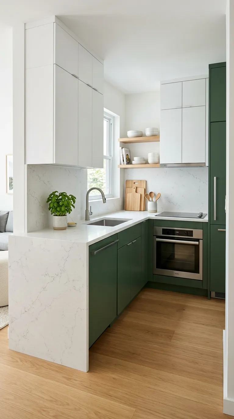
Two-tone white and gray cabinetry adds visual depth without reducing perceived space
7. White Uppers + Sage Green Lowers
Colors: White upper cabinets + soft sage lower cabinets + white/cream walls
Space gain: Medium-High (25-30%)
Style: Modern farmhouse, transitional, contemporary
Pro: On-trend; brings nature indoors; sophisticated color
Con: Trend may date; requires complementary accents
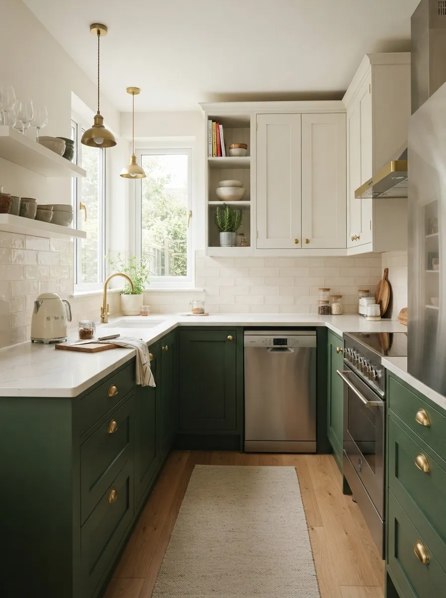
Green and white two-tone cabinets create modern farmhouse appeal with good space perception
8. White Uppers + Navy Lowers
Colors: White upper cabinets + navy blue lower cabinets + white walls
Space gain: Medium (20-25%)
Style: Coastal, transitional, classic
Pro: Sophisticated contrast; timeless combination; hides dirt on lowers
Con: Navy absorbs light; only works with excellent lighting; better for 100+ sq ft kitchens
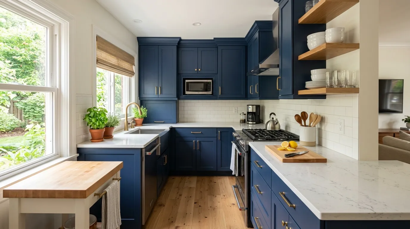
Navy blue lower cabinets with white uppers create sophisticated contrast in well-lit kitchen
9. Cream Uppers + Light Wood Lowers
Colors: Cream/ivory upper cabinets + natural light wood lowers + cream walls
Space gain: Medium-High (25-30%)
Style: Scandinavian, modern farmhouse, organic modern
Pro: Warm and natural; texture variation; timeless
Con: Wood requires maintenance; potential color shift over time
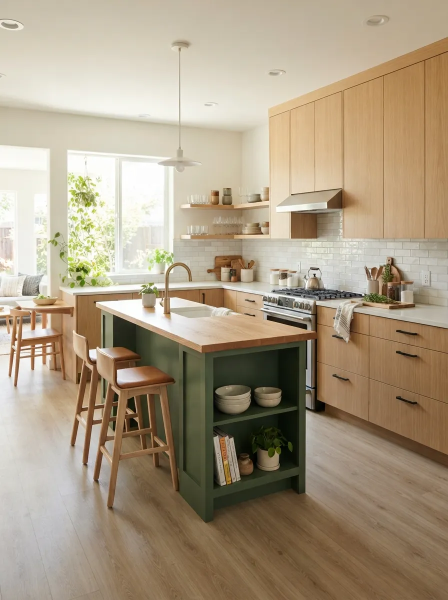
Light wood cabinets with cream uppers deliver Scandinavian warmth and spaciousness
10. White Perimeter + Colored Island
Colors: White perimeter cabinets + colored island (green, blue, gray) + white walls
Space gain: High (30-35%)
Style: Transitional, contemporary, eclectic
Pro: Personality without overwhelming; focal point; flexibility
Con: Requires space for island; color commitment on prominent feature
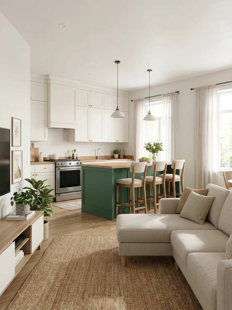
White perimeter with green island creates personality without shrinking space perception
Soft Color Accent Schemes
11. White with Pale Blue Accents
Colors: White cabinets + white walls + pale blue backsplash or accessories
Space gain: High (35-40%)
Style: Coastal, cottage, farmhouse
Pro: Airy and fresh; 10% color rule maintains spaciousness
Con: Can feel cold; requires warm wood or brass balance
12. White with Soft Green Backsplash
Colors: White cabinets + white walls + sage/mint green tile backsplash
Space gain: High (35-40%)
Style: Modern, transitional, organic
Pro: Trending color; nature-inspired; focal point
Con: Tile commitment; may date if too trendy
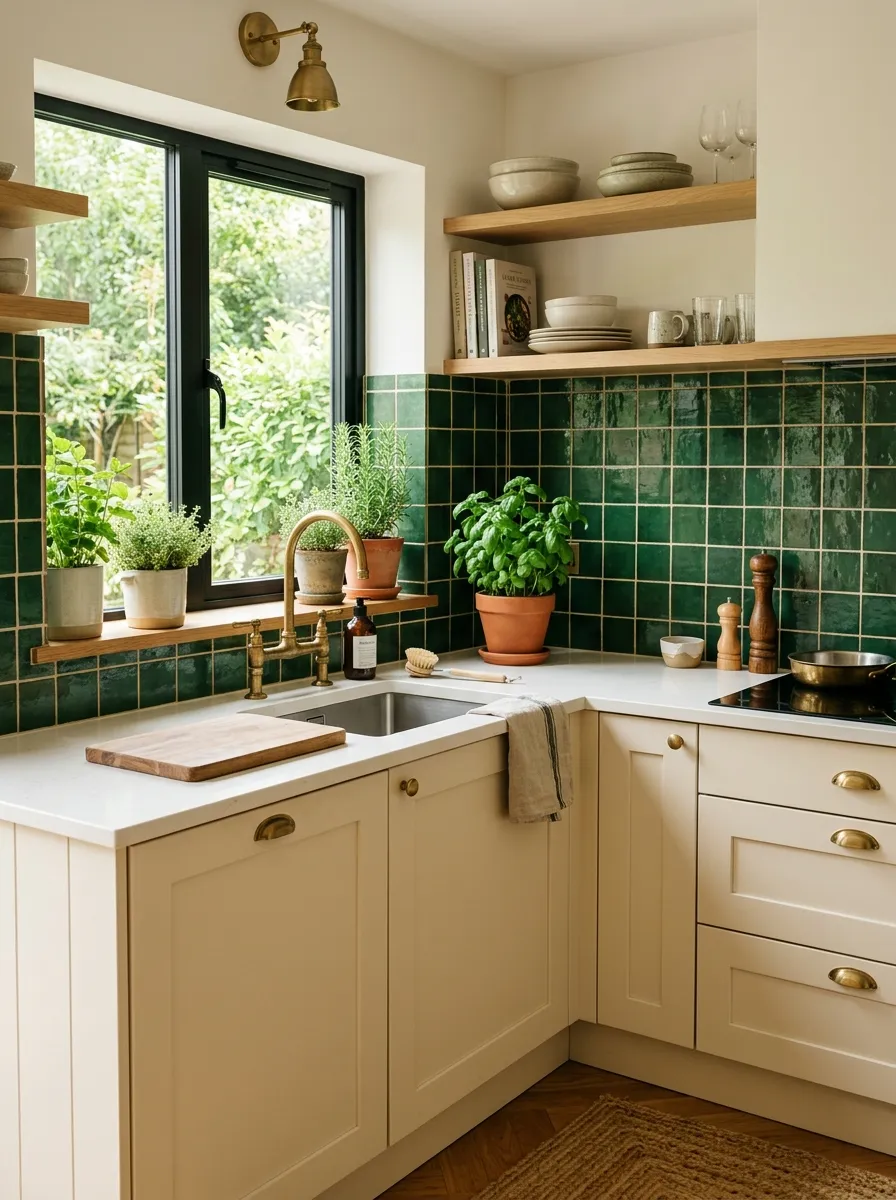
White kitchen with green tile backsplash adds fresh accent without reducing spaciousness
13. Cream with Warm Metallic Accents
Colors: Cream cabinets + cream walls + brass/gold hardware and fixtures
Space gain: High (30-35%)
Style: Glam, transitional, modern traditional
Pro: Luxurious; warm metallics add richness; reflective surfaces
Con: Brass can patina; requires regular polishing
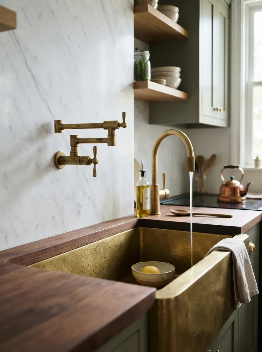
Brass fixtures and warm metallics add luxury to cream kitchen while maintaining brightness
14. Light Gray with Black Accents
Colors: Light gray cabinets + white walls + black hardware, fixtures, window frames
Space gain: Medium-High (25-30%)
Style: Modern, industrial, contemporary
Pro: Crisp contrast; modern aesthetic; defined edges
Con: Black accents can feel heavy; use sparingly (10% maximum)
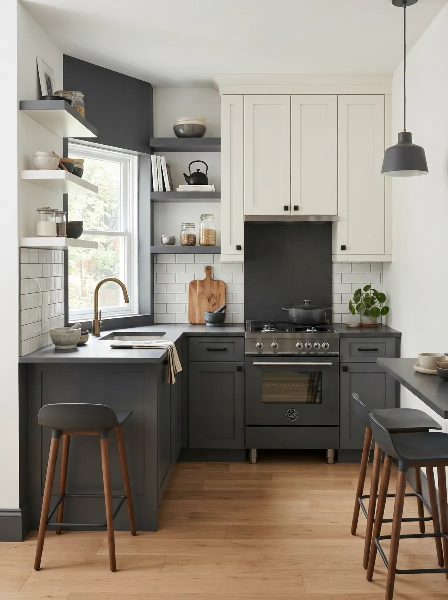
Light gray with charcoal black accents creates crisp modern aesthetic with good space perception
15. White with Natural Wood Tones
Colors: White cabinets + white walls + natural wood floors, shelves, or counters
Space gain: High (30-38%)
Style: Scandinavian, farmhouse, organic modern
Pro: Warm and natural; adds texture; timeless combination
Con: Wood flooring more expensive; requires maintenance
Bold Yet Space-Conscious Schemes
16. White with Forest Green Focal Wall
Colors: White cabinets + white main walls + forest green single accent wall
Space gain: Medium-High (25-30%)
Style: Contemporary, eclectic, transitional
Pro: Bold personality; creates depth; expandable/changeable
Con: Requires careful placement; may feel too bold for some
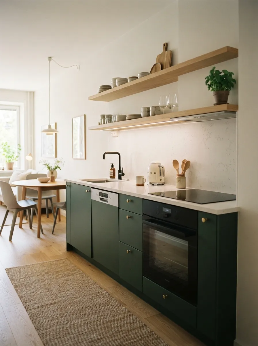
Forest green accent wall adds bold personality while white cabinets maintain spaciousness
17. Soft Gray with Charcoal Island
Colors: Soft gray perimeter cabinets + charcoal/dark gray island + white walls
Space gain: Medium (20-25%)
Style: Modern, transitional, contemporary
Pro: Sophisticated tonal variation; island becomes focal point
Con: Requires excellent lighting; darker island absorbs light
18. White with Patterned Floor Tiles
Colors: White cabinets + white walls + colorful patterned cement floor tiles
Space gain: Medium-High (25-30%)
Style: Mediterranean, eclectic, bohemian
Pro: Personality on floor; white elsewhere maintains space; hides dirt
Con: Busy pattern can overwhelm very small spaces; permanent commitment
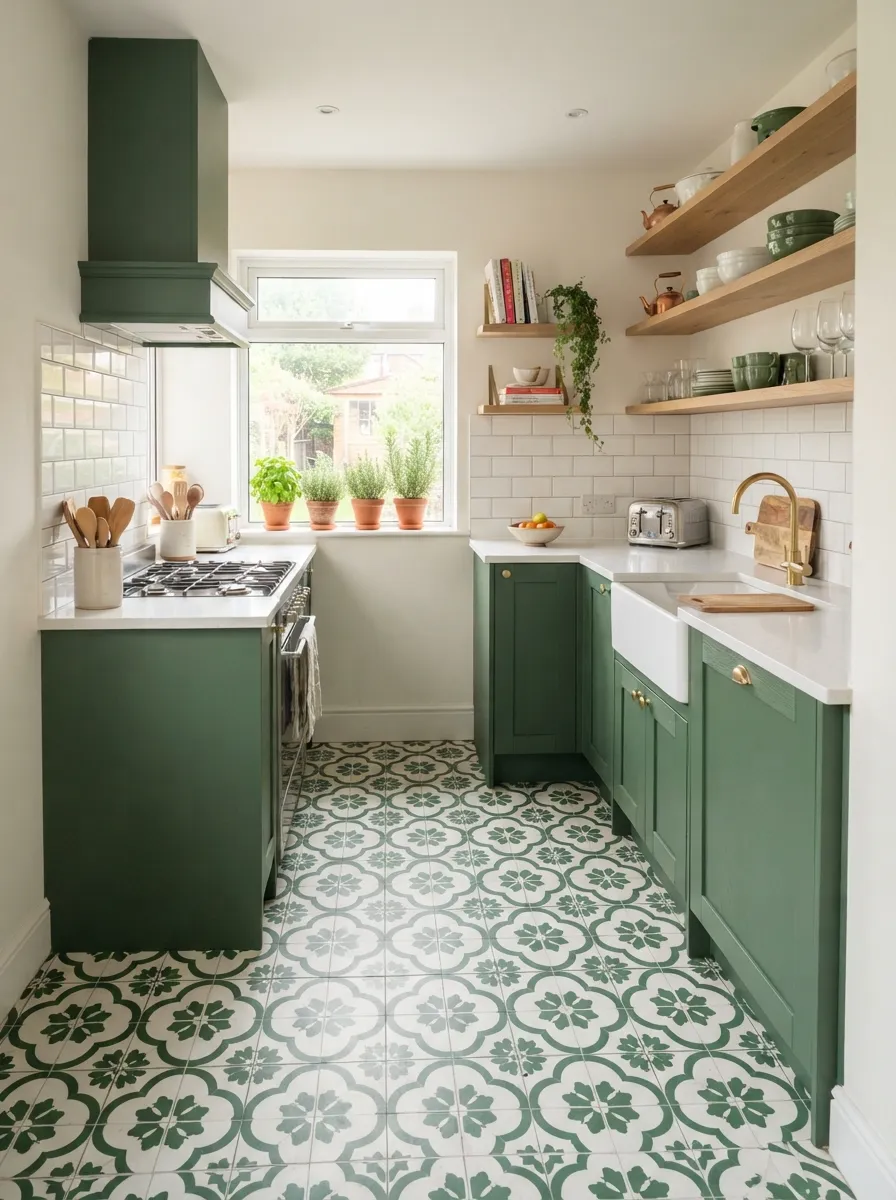
Patterned floor tiles add personality while white cabinets and walls maintain spacious feel
19. Pale Mint and White
Colors: Pale mint/seafoam lower cabinets + white uppers + white walls
Space gain: Medium-High (25-30%)
Style: Retro, cottage, coastal
Pro: Fresh and cheerful; nostalgic appeal; light enough to expand
Con: Can read as dated; requires balance to feel current
20. Warm White with Terracotta Accents
Colors: Warm white/cream cabinets + warm white walls + terracotta/rust accessories, backsplash
Space gain: Medium-High (25-30%)
Style: Mediterranean, Southwestern, organic modern
Pro: Warm and earthy; trending; unique personality
Con: Terracotta advances visually; keep to 10% or less
Contemporary Sophisticated Schemes
21. Monochromatic White with Texture Variation
Colors: All white—matte cabinets + glossy backsplash + textured walls + marble counters
Space gain: Maximum (40-50%)
Style: Modern, minimalist, Scandinavian
Pro: Ultimate expansion; texture prevents flatness; sophisticated
Con: Requires deliberate texture planning; can feel cold
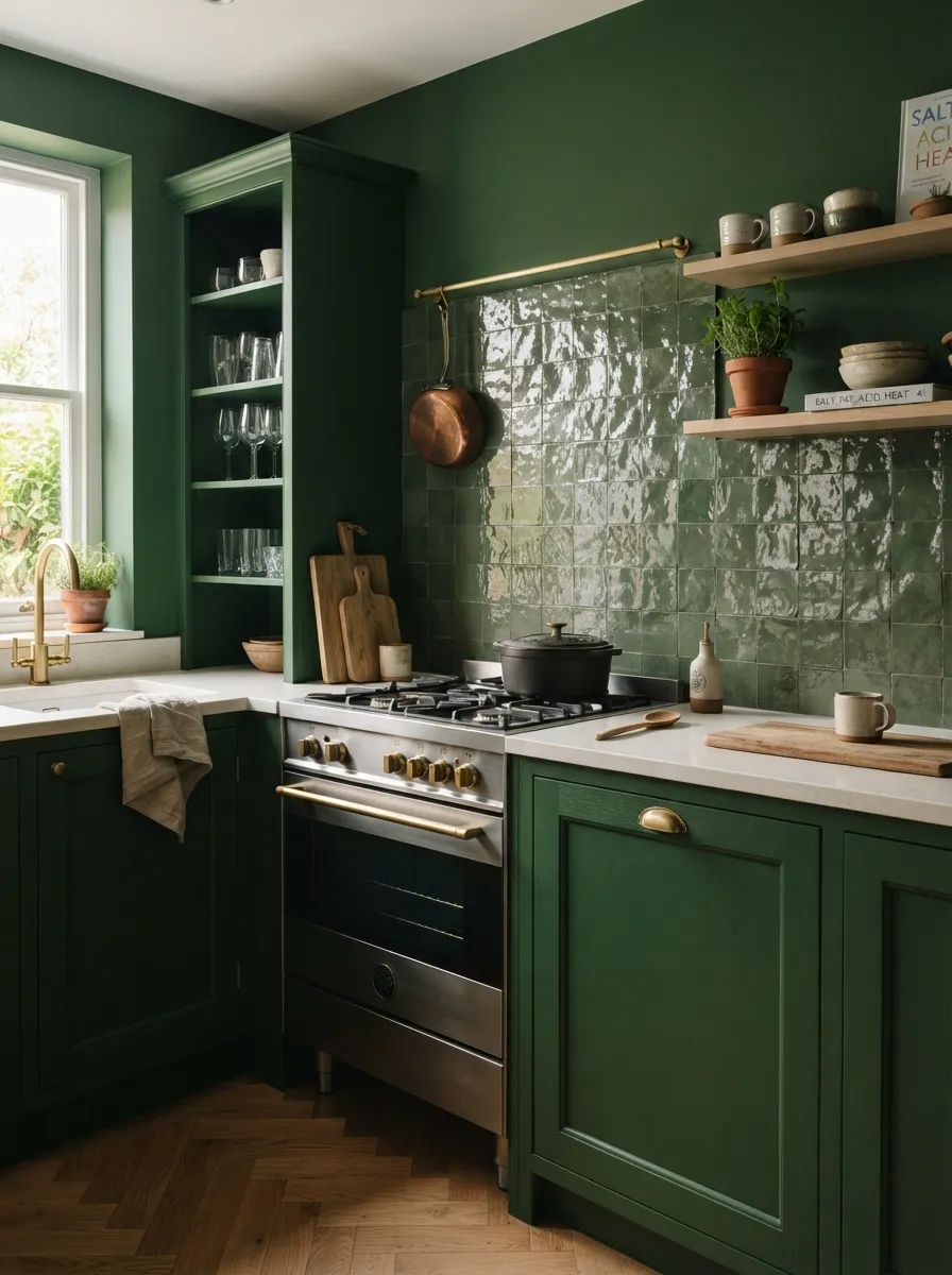
Monochromatic white with varied textures creates sophisticated, spacious aesthetic
22. Light Oak and White Scandinavian
Colors: Light oak/birch wood cabinets + white walls + white ceiling + light wood floors
Space gain: High (30-35%)
Style: Scandinavian, modern, organic
Pro: Warm minimalism; natural materials; timeless
Con: Wood costs more; requires consistent finish across elements
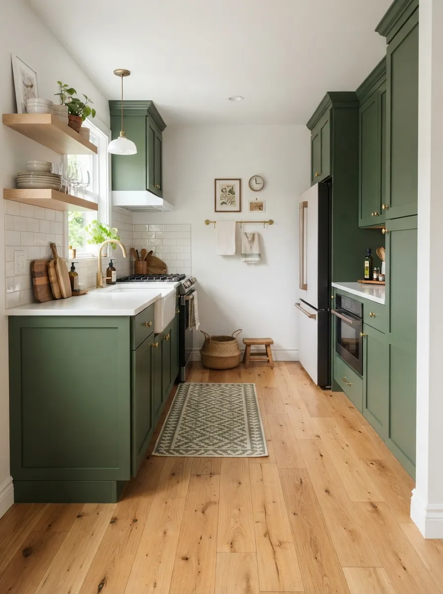
Light oak and white create warm Scandinavian minimalism with excellent space perception
23. Soft Gray with Stainless Steel
Colors: Soft gray cabinets + white walls + stainless appliances, backsplash, hardware
Space gain: Medium-High (25-30%)
Style: Industrial, modern, professional
Pro: Reflective stainless bounces light; professional aesthetic
Con: Shows fingerprints; can feel cold without warm accents
24. White with Mixed Metallics
Colors: White cabinets + white walls + mixed metals (brass faucet, black hardware, chrome appliances)
Space gain: High (30-35%)
Style: Eclectic, transitional, contemporary
Pro: Layered interest; currently trending; flexible
Con: Requires intentional planning to avoid chaotic appearance
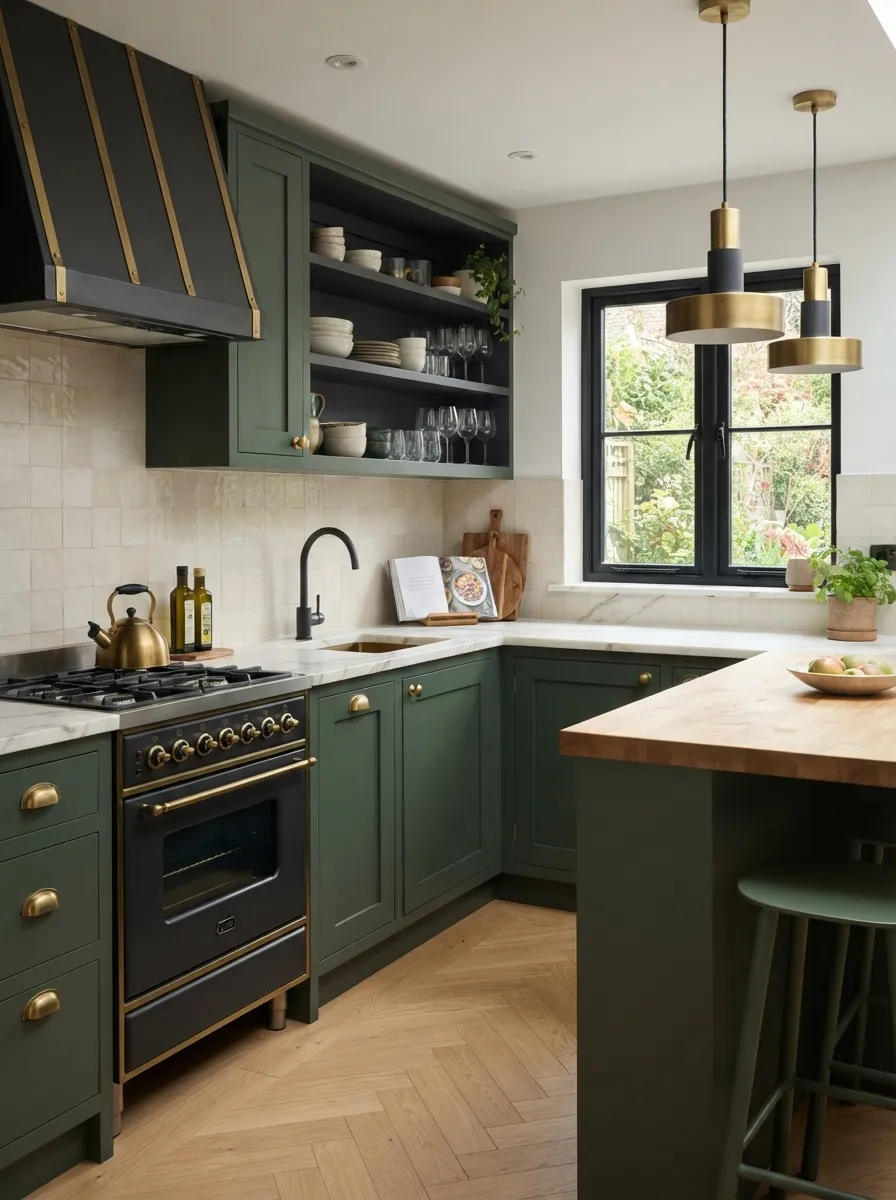
White kitchen with mixed metal finishes adds layered interest while maintaining brightness
25. Biophilic Green and Natural Materials
Colors: Soft sage cabinets + warm white walls + wood counters + plants + natural stone
Space gain: Medium (20-25%)
Style: Biophilic, organic modern, nature-inspired
Pro: Connects to nature; calming; trending wellness design
Con: Multiple natural materials require careful coordination; more expensive
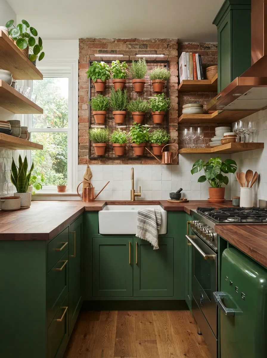
Biophilic design with soft green and natural materials creates calming, nature-inspired kitchen
How to Choose Your Perfect Color Scheme
Selecting from 25+ options can feel overwhelming. These strategic considerations help you narrow choices to schemes perfectly suited to your specific kitchen, lifestyle, and design preferences.
Assess Your Kitchen’s Natural Light
Natural light quantity and quality fundamentally determine which colors will succeed in your space.
- Abundant natural light (3+ windows): Can handle darker accents, navy lowers, or colored islands without feeling cramped
- Moderate light (1-2 windows): Stick with light to medium tones; white/cream uppers with soft colored lowers
- Limited light (no windows/north-facing): Require lightest colors—all white or cream; avoid any dark colors
- Direction matters: North-facing kitchens need warm whites; south-facing can handle cooler tones
Consider Your Kitchen Size
Actual square footage dictates how much color variation your space can handle without feeling cramped.
- Under 70 sq ft: Monochromatic schemes (all white, all light gray); absolutely avoid dark colors
- 70-100 sq ft: Two-tone acceptable (white uppers + light lowers); 10% accent color maximum
- 100-150 sq ft: More flexibility; can handle colored island, bolder two-tone, or single dark wall
- 150+ sq ft: Most color schemes work; still benefit from light-dominant palettes
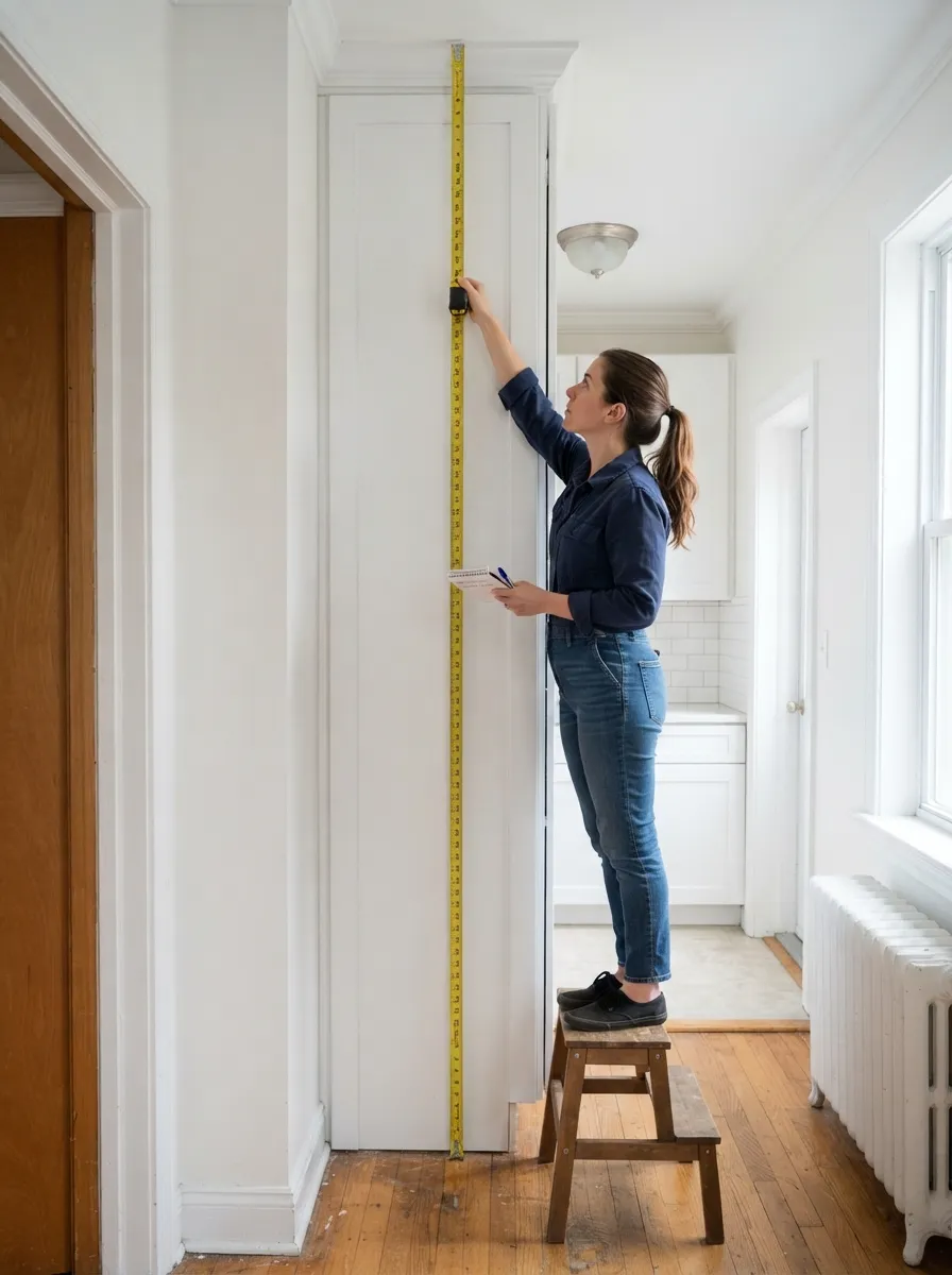
Measuring kitchen dimensions helps determine appropriate color scheme complexity for space
Match Your Design Style
Your preferred aesthetic naturally suggests compatible color schemes.
- Modern/Minimalist: All-white, light gray monochrome, white with black accents
- Scandinavian: White with light wood, cream and wood, light oak and white
- Farmhouse: White with sage green, cream and white, white with wood accents
- Coastal: White with pale blue, soft gray with white, cream with aqua accents
- Traditional: Cream and white, greige blend, white with brass accents
- Industrial: Light gray with stainless, white with black accents, concrete gray
Coordinate with Existing Elements
Unless planning complete renovation, your color scheme must work with unchangeable elements.
- Countertops staying: Choose cabinet/wall colors that complement counter color and veining
- Flooring unchanged: Coordinate cabinet colors with floor tone (cool with cool, warm with warm)
- Backsplash remaining: Use backsplash as inspiration for cabinet/wall colors
- Appliances staying: Stainless suggests cool tones; white/black appliances more flexible
- Adjacent rooms visible: Ensure kitchen colors flow harmoniously with connecting living/dining areas
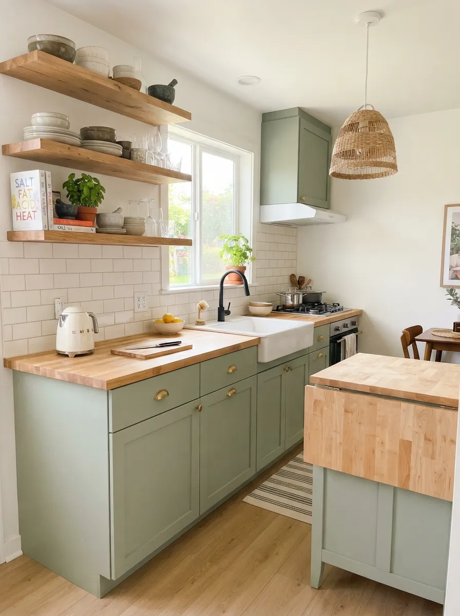
Updated green cabinets coordinate beautifully with existing countertops and flooring
Test Before Committing
Never select colors based solely on tiny paint chips or online photos. Proper testing prevents expensive regrets.
- Purchase samples: Buy quart-size paint samples of top 3-4 color choices ($5-10 each)
- Paint large swatches: Apply 2’x2′ sections on different walls (not tiny patches)
- Observe over days: View swatches in morning, afternoon, evening, and nighttime lighting
- Compare to materials: Hold countertop/flooring samples against painted swatches
- Live with it: Spend 3-5 days minimum before deciding; initial reactions often change
- Check undertones: Notice if colors look too yellow, pink, blue, or green in your specific lighting
Color Application Strategies for Maximum Space
Where and how you apply colors significantly impacts spatial perception. Strategic placement maximizes expansion effects while creating visual interest.
The 60-30-10 Rule for Small Kitchens
Professional designers use this proportion formula to create balanced, harmonious color schemes that feel intentional rather than chaotic.
- 60% Dominant color: Main cabinets, walls, or largest surfaces in lightest, most space-expanding color
- 30% Secondary color: Either upper or lower cabinets, flooring, or backsplash in complementary medium tone
- 10% Accent color: Hardware, accessories, textiles, small appliances in boldest or darkest shade
- Small kitchen adaptation: Often better to use 70-20-10 or even 80-15-5 for maximum expansion
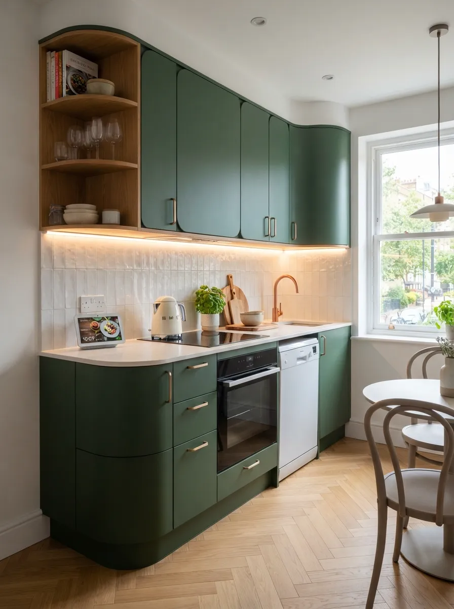
Properly proportioned color scheme demonstrates 60-30-10 rule in small kitchen application
Strategic Cabinet Color Placement
In two-tone kitchens, upper versus lower cabinet color assignment dramatically affects spatial perception.
Light Uppers + Darker Lowers (Recommended)
- Why it works: Light colors at eye level expand; darker lowers ground space without overwhelming
- Spatial effect: Creates vertical expansion; draws eyes upward to light cabinets and ceiling
- Practical benefit: Darker lowers hide scuffs, dirt, and wear better than light colors
- Best combinations: White uppers + sage/gray/navy lowers; cream uppers + wood lowers
Dark Uppers + Light Lowers (Use Cautiously)
- Effect: Creates top-heavy, cave-like feeling in small spaces
- When acceptable: Kitchens 120+ sq ft with 9’+ ceilings and excellent natural light
- Better alternative: Dark lowers with light uppers, or all light with dark island/peninsula
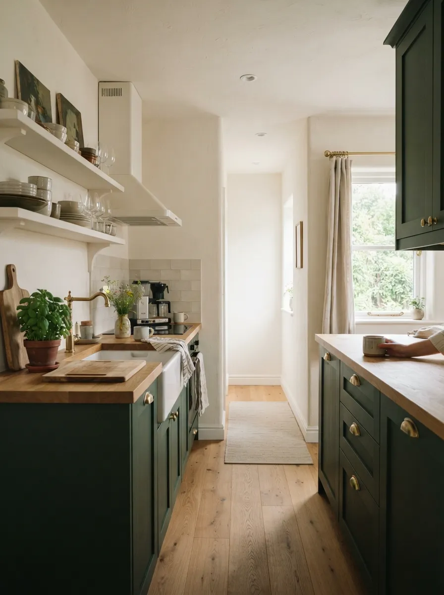
Light upper cabinets with green lowers demonstrate strategic two-tone placement for space expansion
Wall Color Application
Wall color choices affect how cabinets, counters, and overall space feel.
- Match cabinets: Walls same color as cabinets eliminates visual boundaries; maximum expansion
- One shade lighter: Walls slightly lighter than cabinets defines cabinets gently without harsh contrast
- White/cream always: White walls work with any cabinet color; safe, space-expanding choice
- Accent wall sparingly: If using colored accent wall, place behind open shelving or in dining nook, not behind full wall of cabinets
Ceiling Color Strategy
The often-forgotten “fifth wall” significantly impacts perceived height and overall brightness.
- White ceiling: Standard and safest; makes ceilings appear highest; reflects maximum light downward
- Lighter than walls: Ceiling slightly lighter than wall color creates gentle upward draw
- Same as walls: Eliminates boundaries; makes small spaces feel larger but can reduce perceived height
- Avoid darker ceilings: Dark ceilings close in spaces; only work in large kitchens with high ceilings
Floor Color Considerations
While often determined by existing materials or budget constraints, flooring color significantly impacts overall scheme.
- Light floors: Maximize brightness and expansion; show dirt more easily; currently trending
- Medium floors: Most practical for hiding dirt; work with most color schemes; versatile
- Dark floors: Ground spaces; create sophisticated contrast with light cabinets; absorb light
- Wood tone coordination: Match wood floor warmth to cabinet and counter tones for cohesion
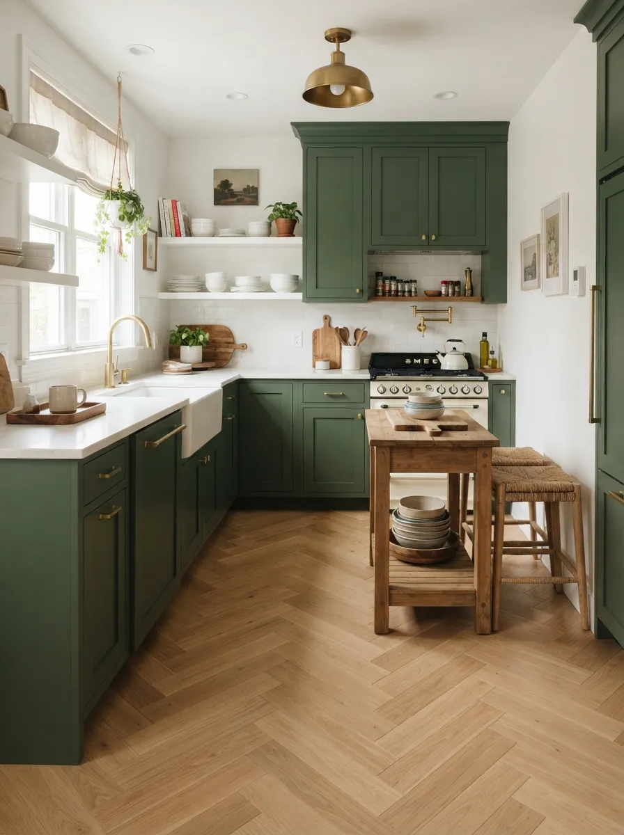
Herringbone wood flooring coordinates with cabinet tones creating cohesive color flow
Backsplash as Color Bridge
The backsplash serves unique role connecting counters to cabinets while offering accent color opportunity.
- Neutral bridge: White/cream subway tile connects any cabinet and counter combination safely
- Color introduction: Colored backsplash brings personality while occupying small percentage of visual space
- Counter coordination: Pull backsplash color from counter veining for cohesive flow
- Reflective option: Glass or glossy tile backsplash reflects light; expands space like mirrors
Common Color Mistakes That Shrink Small Kitchens
Avoiding these frequent errors ensures your color scheme maximizes rather than minimizes your small kitchen’s spatial potential.
1. Using Too Many Colors
The most common mistake—introducing too many competing colors creates visual chaos that fragments space and makes kitchens feel smaller.
- The problem: Eyes jump from color to color, unable to rest; space feels busy and smaller
- The fix: Stick to 2-3 colors total; use 60-30-10 proportion rule rigorously
- Exception: Multicolor patterned tile works if used only on floor or small backsplash area with all other surfaces neutral
2. All-Dark Color Schemes
While dramatic dark kitchens photograph beautifully, they function poorly in actually small spaces with typical lighting.
- The mistake: Dark cabinets + dark counters + dark floors + dark walls
- The result: Cave-like spaces feeling 40-50% smaller; requiring excessive artificial lighting
- The fix: If loving dark colors, use on lowers only; pair with white uppers, walls, and ceiling
- Reality check: Dark kitchens require 120+ sq ft, 9’+ ceilings, multiple windows to succeed
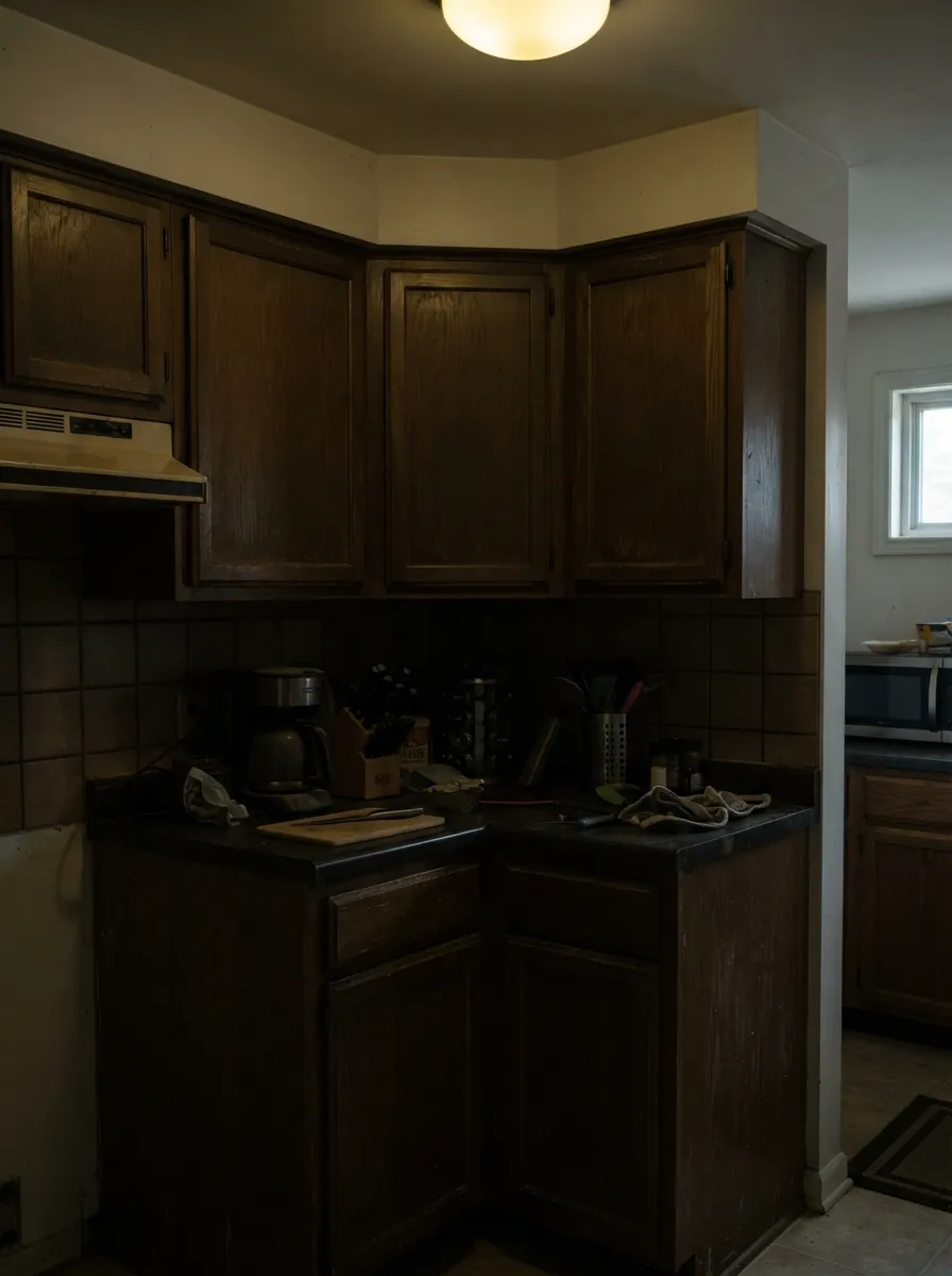
Dark colors with inadequate lighting create cramped, cave-like feeling in small kitchen
3. Ignoring Undertones
Failing to identify and coordinate color undertones creates clashing, disjointed schemes even when using “safe” neutrals.
- The issue: Cool gray cabinets + warm beige walls = muddy, fighting appearance
- Undertone types: Warm (yellow, orange, red base) vs. cool (blue, green, gray base)
- Testing method: Compare paint color to pure white; tint that appears reveals undertone
- Coordination rule: Match undertones across all elements—all warm or all cool
4. Wrong White Selection
Assuming “white is white” leads to mismatched, dingy-looking schemes. Whites vary dramatically in warmth, brightness, and undertone.
- Problem whites: Cool white cabinets + warm cream walls = cabinets look blue/gray; walls look yellow
- White categories: Pure/bright white, warm white, cool white, off-white, cream
- Testing imperative: Paint samples of multiple whites; observe next to each other
- Safe choice: Match white undertone to dominant lighting (warm whites for warm light; cool whites for cool/natural light)
5. Forgetting About Lighting Effects
Selecting colors based only on daytime appearance ignores how different they’ll look under artificial evening lighting.
- LED effect: Cool LED bulbs make warm colors look dingy; warm LEDs make cool colors look yellow
- Incandescent legacy: Warm incandescent bulbs (being phased out) warmed all colors significantly
- Testing requirement: Observe color samples under both natural daylight AND your actual light fixtures at night
- Bulb coordination: Choose bulb color temperature (Kelvin) compatible with your color scheme
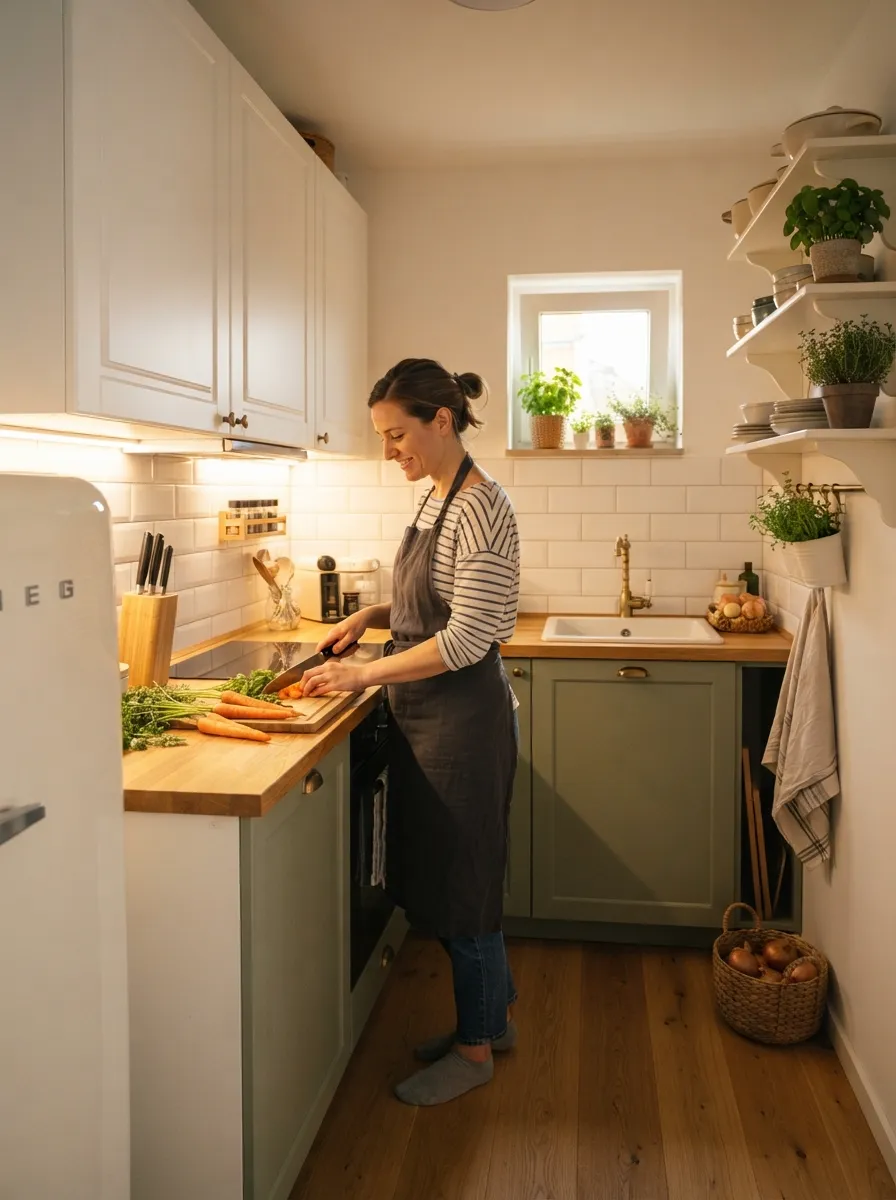
Proper lighting ensures colors render accurately throughout day and night in small kitchen
6. Mismatched Color Temperatures
Mixing cool and warm colors without intentional strategy creates uncomfortable, disjointed feeling.
- Example mistake: Cool gray cabinets + warm oak floors + cool white counters + warm brass hardware
- Visual result: Nothing relates; eyes confused; space feels disorganized
- Intentional mixing: Can work when one temperature dominates 70-80% with other as accent
- Safest approach: Commit to predominately warm OR predominately cool throughout
7. Trendy Colors Without Exit Strategy
Committing entire kitchen to ultra-trendy colors risks dated appearance within 3-5 years.
- High-risk choices: Millennial pink, specific “color of the year,” very specific shade of popular color
- Better approach: Trendy color on easily changeable elements (walls, accessories, backsplash)
- Cabinet consideration: If using trendy cabinet color, choose classic version (sage green vs. neon lime)
- Timeless test: Ask “Will I love this in 10 years?” If unsure, choose more classic alternative
8. Ignoring Adjacent Room Colors
Failing to consider visible connecting spaces creates jarring transitions and reduces overall home cohesion.
- Open floor plans: Kitchen must coordinate with visible living/dining room colors
- Doorways/sightlines: Colors visible through doorways should relate harmoniously
- Flow strategy: Use same or similar wall color in kitchen and adjacent spaces for seamless flow
- Variation allowed: Different cabinet colors acceptable if wall colors coordinate
Small Kitchen Color Scheme Gallery
Explore inspiring color combinations demonstrating various schemes, applications, and styles for small kitchens.
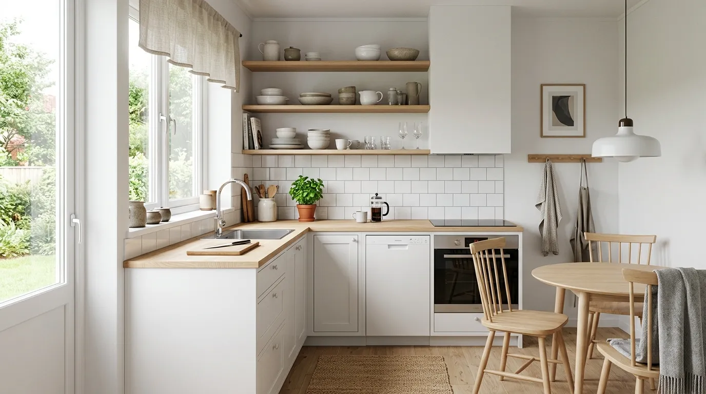
Bright Scandinavian color scheme with white and light wood creates ultimate airiness
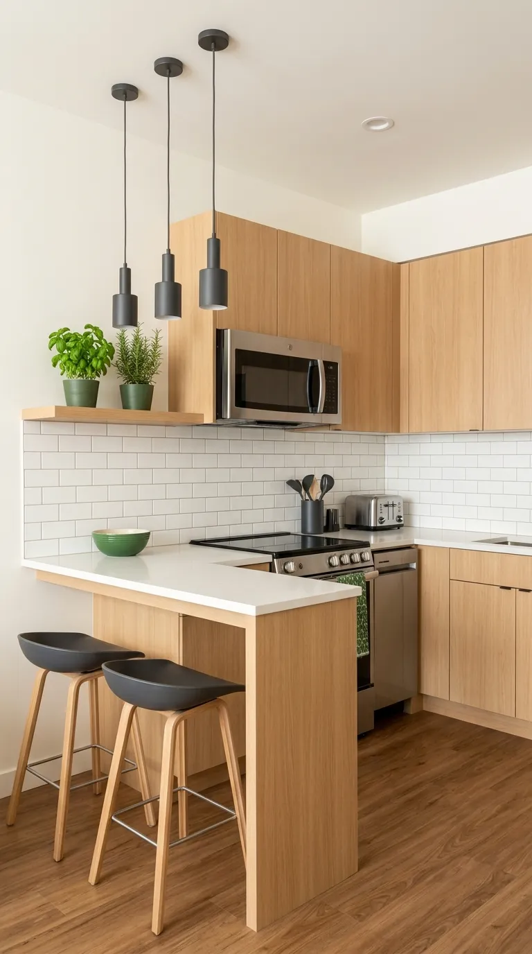
Warm wood and cream color palette brings natural warmth to compact apartment kitchen
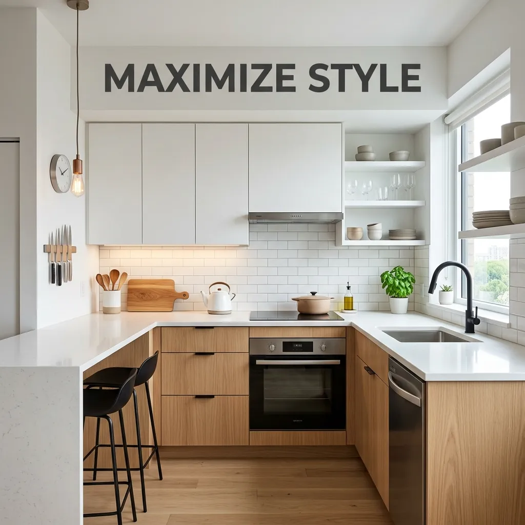
Minimalist monochromatic white and gray color scheme maximizes modern simplicity

Coastal blue and white color scheme creates fresh, beach-inspired atmosphere
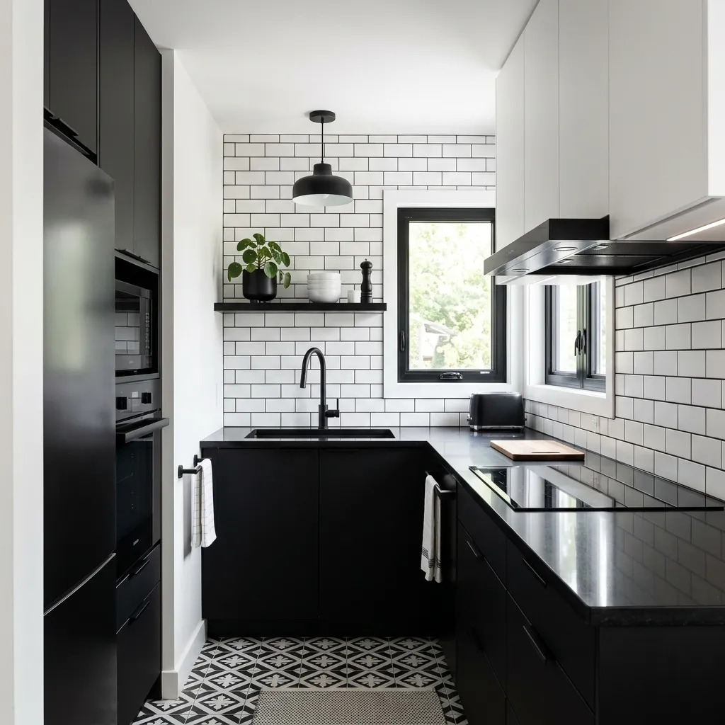
Black and white high-contrast scheme works in larger small kitchens with excellent lighting
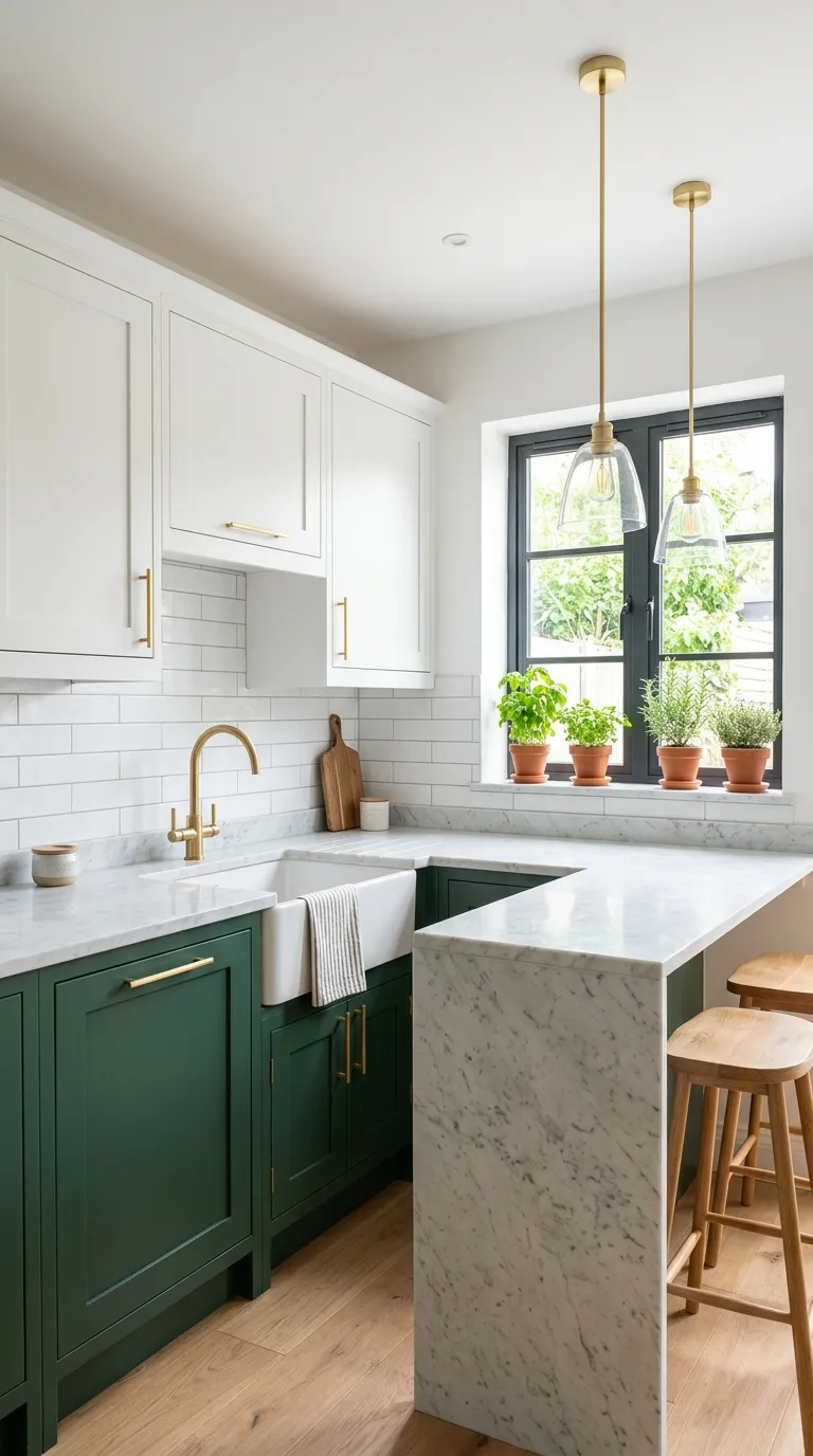
White and green two-tone scheme delivers fresh, modern aesthetic with good spaciousness
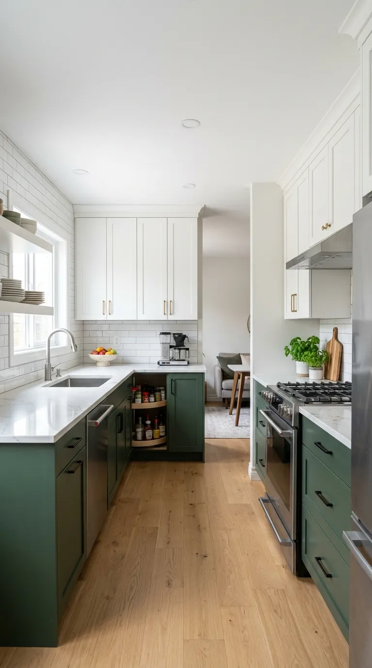
Green cabinets balanced with white surfaces maintain brightness in L-shaped layout
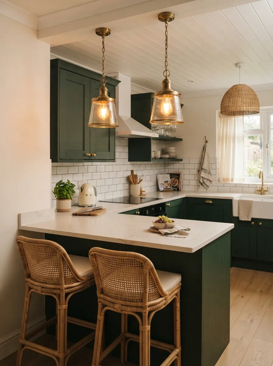
Cream with brass metallic accents creates warm, sophisticated color combination
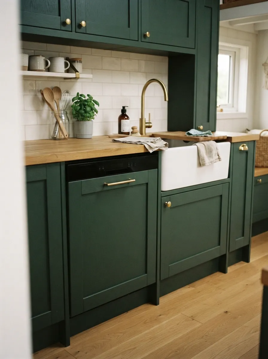
Forest green with charcoal appliances demonstrates bold yet sophisticated color pairing
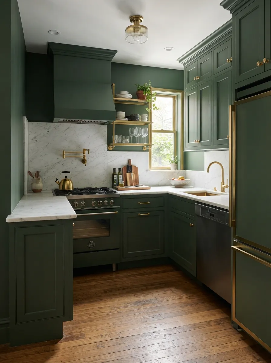
Compact kitchen with forest green and warm white creates nature-inspired color story
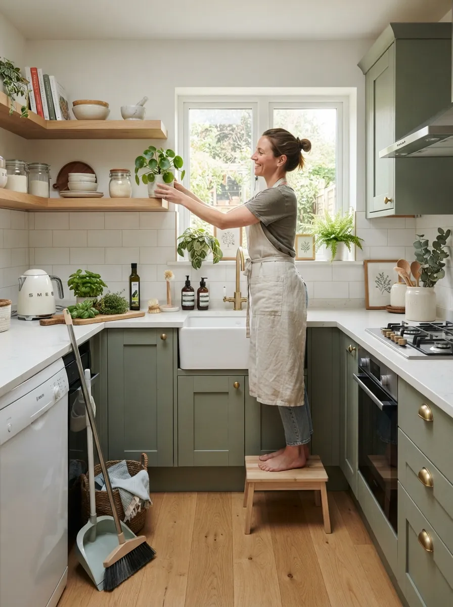
Styled white kitchen demonstrates cohesive color palette through accessories and accents
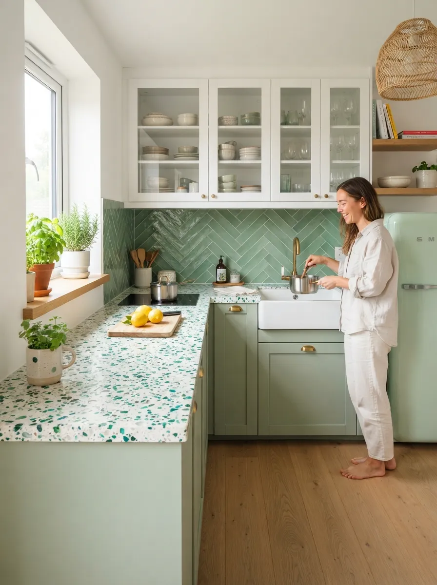
Recycled glass countertop adds colorful accent to neutral white cabinet base
Frequently Asked Questions About Small Kitchen Color Schemes
What is the best color scheme for a small kitchen?
The best color scheme for small kitchens is all-white or light monochromatic (white cabinets + white walls + white ceiling), making spaces feel 35-45% larger through maximum light reflection. Second best: white upper cabinets + light gray or soft sage lower cabinets + white walls, providing depth without shrinking space. Third best: light cream with natural wood accents for warmth. Choose based on your natural light—kitchens with limited windows absolutely require lightest colors, while those with abundant natural light can handle slightly darker lowers or colored islands. See our comprehensive interior design guide for more color strategies.
What colors make a small kitchen look bigger?
Light colors make small kitchens look bigger: pure white (40-50% expansion), light gray (30-35%), soft cream (30-35%), pale sage green (20-25%), soft blue (20-30%), and light greige (25-30%). These colors reflect 70-80% of light vs. 10-20% for dark colors, brightening spaces and making walls appear to recede. Cool colors (grays, blues, greens) recede more than warm colors (creams, beiges) but can feel cold without warm accents. For maximum expansion, use same light color on cabinets, walls, and ceiling to eliminate visual boundaries. Glossy finishes reflect more light than matte, further expanding perceived space.
Should small kitchen cabinets be light or dark?
Small kitchen cabinets should be light (white, cream, light gray, pale sage) to maximize space perception and brightness. Light cabinets reflect light, making kitchens feel 30-40% larger. Dark cabinets (navy, black, deep green) absorb light and make spaces feel 40-50% smaller—only appropriate in larger small kitchens (120+ sq ft) with excellent natural light and 9’+ ceilings. Best compromise: light upper cabinets + medium-toned lower cabinets (light gray, soft green) creating depth without overwhelming. Dark lowers hide scuffs and dirt better than light colors while light uppers maintain brightness at eye level. Avoid dark upper cabinets entirely in small kitchens—they create cave-like, oppressive feeling.
What is the most popular kitchen color scheme?
The most popular kitchen color scheme remains all-white (white cabinets + white walls + white/light counters) due to its timelessness, versatility, and space-maximizing properties. Second most popular: white upper cabinets + gray, sage, or navy lower cabinets for trendy two-tone look. Third: white/cream cabinets with natural wood accents (floors, counters, shelving) for Scandinavian-farmhouse aesthetic. Fourth: light gray monochromatic for contemporary style. Trending 2024-2025: soft sage green with white, forest green accent islands, warm neutrals with brass metallics, and biophilic schemes featuring multiple natural materials. Popularity doesn’t equal appropriateness—choose based on YOUR kitchen’s size, light, and your design preferences.
How do I choose a color scheme for my small kitchen?
Choose small kitchen color schemes by: (1) assessing natural light—limited light requires lightest colors; abundant light allows darker accents, (2) measuring square footage—under 70 sq ft needs monochromatic; 100+ sq ft handles two-tone, (3) identifying design style—modern uses whites/grays; farmhouse uses creams/greens; coastal uses whites/blues, (4) coordinating with unchangeable elements—match cabinet colors to existing counters/floors, (5) testing paint samples on actual walls in morning, afternoon, and evening light over 3-5 days, (6) applying 60-30-10 rule—60% lightest color, 30% medium tone, 10% accent, and (7) checking undertones—all warm or all cool throughout. Start with lightest option; you can always go darker but rarely lighter successfully.
Can I use dark colors in a small kitchen?
Yes, but strategically and sparingly. Use dark colors on lower cabinets only with white uppers and walls, as single accent wall behind open shelving, on kitchen island while keeping perimeter light, in 10% accent role (hardware, fixtures, small appliances), or on floors if cabinets and walls remain light. Never use dark colors on all cabinets, all walls, uppers only, or in kitchens under 80 sq ft with limited natural light. Dark kitchens require 120+ sq ft, 9’+ ceilings, multiple windows, and excellent artificial lighting to avoid cave-like feeling. Even then, pair dark elements with light surfaces—dark cabinets need light counters/walls; dark counters need light cabinets. Test extensively before committing.
What is the 60-30-10 color rule?
The 60-30-10 rule is professional interior design formula for balanced color schemes: 60% dominant color (usually lightest—walls, main cabinets, ceiling), 30% secondary color (medium tone—backsplash, flooring, accent cabinets), 10% accent color (boldest/darkest—hardware, accessories, textiles, small appliances). This proportion prevents color chaos while creating visual interest. In small kitchens, often better to use 70-20-10 or 80-15-5 for maximum space expansion. Example: 60% white (cabinets, walls), 30% light gray (floors, backsplash), 10% brass (hardware, fixtures). Another: 70% cream (cabinets, walls), 20% natural wood (floors, shelves), 10% sage green (accessories, plants). Apply to entire visible space, not individual walls.
Should kitchen cabinets be lighter or darker than walls?
In small kitchens, cabinets and walls should be the same color or cabinets slightly darker than walls—never significantly darker. Same color (white cabinets + white walls) eliminates visual boundaries creating maximum expansion. Cabinets one shade darker than walls defines cabinetry gently while maintaining spaciousness. Significantly darker cabinets than walls creates heavy, oppressive feeling making space feel smaller. Exception: white walls work with any cabinet color as universal neutral. For two-tone cabinets, keep uppers same color or lighter than walls; lowers can be darker. Avoid dark cabinets with light walls in kitchens under 100 sq ft—stark contrast emphasizes small size. Test combinations with samples before committing.
What color cabinets are timeless?
Timeless cabinet colors include: (1) pure white—classic for 100+ years, works with all styles, maximum resale value, (2) warm white/cream—traditional elegance, never dates, coordinate with brass/gold, (3) light gray—contemporary yet lasting, sophisticated alternative to white, (4) natural light wood (maple, oak, birch)—Scandinavian appeal, organic warmth, and (5) soft sage green—nature-inspired, classic enough for longevity unlike neon/lime greens. Avoid: ultra-trendy colors (millennial pink, specific “color of year”), very dark colors without excellent lighting, stark black (too harsh for small spaces), purple/orange/red (too bold for timelessness). Classic test: prevalent in well-designed kitchens for 20+ years = likely timeless. Choose lighter versions of trendy colors for safety.
How do I make my small kitchen brighter with color?
Make small kitchens brighter with color by: (1) using all white or cream—reflects maximum light throughout, (2) choosing glossy cabinet finishes vs. matte—shiny surfaces bounce light like mirrors, (3) painting ceiling bright white—reflects light downward, (4) installing glass or glossy tile backsplash—reflective surfaces multiply light, (5) using light-colored flooring—reflects light upward, (6) eliminating dark colors entirely—they absorb 80-90% of light, (7) coordinating with warm-white LED bulbs (2700-3000K)—enhances warm colors; cool LEDs for cool schemes, (8) keeping walls same color as cabinets—seamless light reflection, and (9) adding mirrors strategically—behind open shelving or opposite windows. Combine multiple strategies for cumulative brightness increase.
Transform Your Small Kitchen with Perfect Color Schemes
Small kitchen color schemes wield transformative power to visually expand cramped cooking spaces, making them feel 30-50% larger without expensive structural changes. From classic all-white palettes delivering maximum space expansion to sophisticated two-tone combinations adding depth without shrinking, strategic color selection represents one of the most impactful yet budget-friendly design decisions available to small kitchen owners.
The 25 color schemes presented here span styles from minimalist modern to warm farmhouse, coastal fresh to sophisticated contemporary—each carefully curated to maximize spatial perception while delivering cohesive, beautiful aesthetics. Whether you prefer the timeless safety of monochromatic whites, the trending appeal of sage green and cream, or the bold sophistication of navy and white two-tone, understanding which colors expand space, how to apply them strategically, and which mistakes to avoid empowers you to create kitchens that feel spacious, bright, and uniquely yours.
Remember that successful color schemes depend on multiple factors working together: your kitchen’s actual size and natural light dictate how much color variation the space can handle, your design style suggests compatible palettes, existing unchangeable elements require coordination, and thorough testing prevents expensive regrets. The 60-30-10 proportion rule, strategic placement of light colors at eye level, and elimination of visual boundaries through color matching all contribute to maximum spatial expansion.
Start with the lightest option that appeals to you—you can always add darker accents through easily changeable elements like accessories, textiles, or accent walls, but reversing an all-dark scheme requires complete renovation. Test paint samples extensively under various lighting conditions, coordinate undertones religiously, and trust the space-expanding science behind light color reflection. Your small kitchen has tremendous potential waiting to be unlocked through strategic, thoughtful color selection.
Ready to explore more small kitchen transformation strategies? Discover complementary design elements in our guides to cabinet selection, backsplash design, interior design principles, and complete renovation planning to create the beautiful, spacious-feeling small kitchen you’ve envisioned.